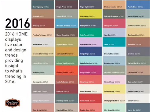
I always find it really interesting to look at colour trends. So here are some trends for 2016. When I compare these colours to the yarn colours I choose to work with and look at, wow what a difference! I prefer rich and saturated colour.
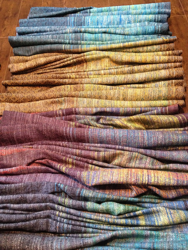
Mixing colour in weaving is unlike mixing paint or dye. Colours or hues simultaneously work their magic, and you tend to get colour effects. The variables of weave structure, yarn texture and sett play a big part in how colour appears. With one warp you can play around with colour to get really varied results. This is an example of one warp, with different wefts to create different colours in each piece, from Banu Textiles.
Mixing colour in weaving is unlike mixing paint or dye. Colours or hues simultaneously work their magic, and you tend to get colour effects. The variables of weave structure, yarn texture and sett play a big part in how colour appears. With one warp you can play around with colour to get really varied results. This is an example of one warp, with different wefts to create different colours in each piece, from Banu Textiles.
 RSS Feed