Mary Lou Trinkwon
  • Home
  • About
  • art
    • Current >
      • Weaving Indralaya
      • Settlers (Working Title)
      • Shelf Portrait 2017
      • Jacquard Studies
      • The Seeing of Sweet Knees
      • Evocative Objects:Useful Companions
      • Mme. XYZ
    • 2000's >
      • Loss, Reclamation and Recovery
      • Between You and Me
      • Water Study
      • A Gothic Tale
      • Needlewomen
    • 1990s >
      • Labrys Rising Dance Academy
    • 1980s >
      • A Certain Jouissance
    • Writing >
      • Evocative Objects:Useful Companions
      • TSA 2010
      • M.Ed
      • TSA 2006
  • contact
  • Workshops
  • Blog
  • New Page

February 28th, 2016

2/28/2016

0 Comments

 
Picture
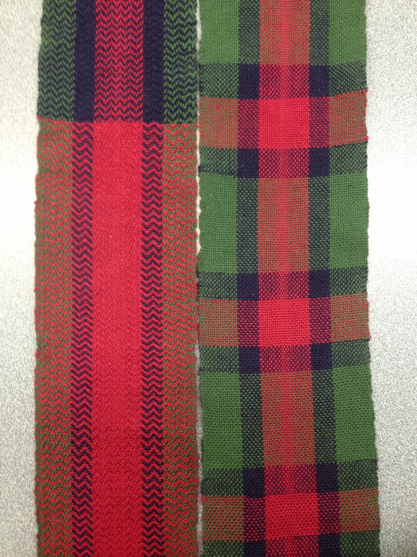
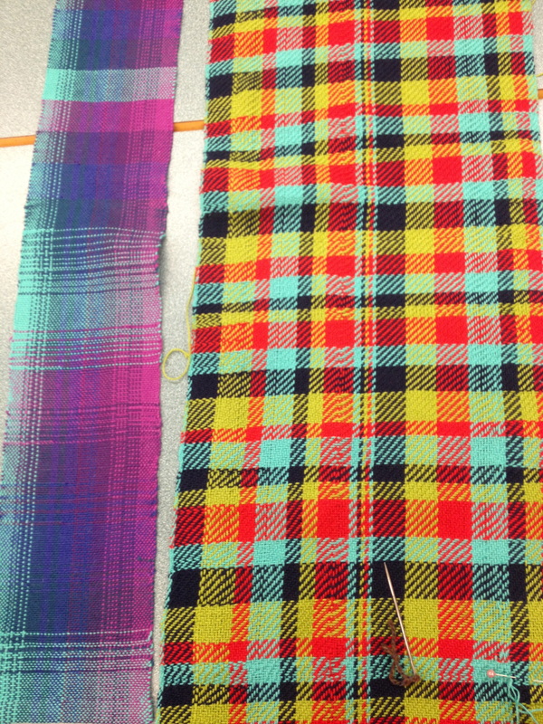
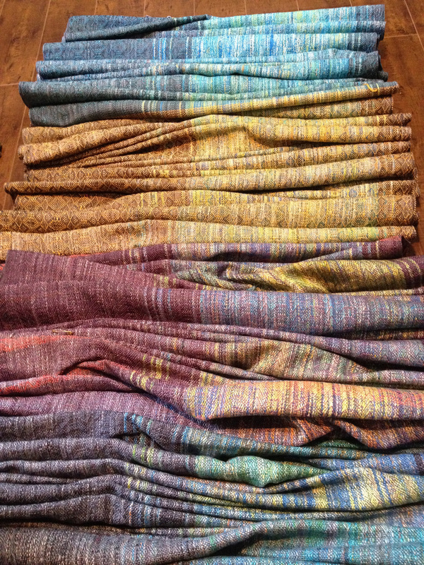
Here is another final colour project!
Picture
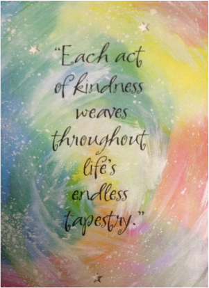
We started this 8 week course talking about textile metaphors. We created a list and added as we went. Diane gave me this card and I wanted to share it with you all, as it really sums things up nicely, thanks Diane! And thanks to all of you who came each week to learn with me! 
0 Comments

Colour Projects

2/21/2016

2 Comments

 
Picture
Working with colour in weaving is really exciting and the possibilities of choices to be made are endless as are the reasons for making your choices. Two students tackled the challenge of colour in two very different ways. Susan wanted to explore colour blending, so she made a narrow sampler of 5 colours and explored different ways to blend, her intention was not to have blocks or stripes. Really successful! This was a plain weave 20 epi 2/8 cotton. Louise has been explore her Scottish ancestry so I encouraged her to make her tartan, my evil plan to turn every weaver into a Tartan weaver is beginning! A really fabulous sample using a simple twill, 20 epi and again the same 2/8 cotton. It is so interesting that even though they are the same epi and the same material, they have a very different appearance. One could almost imagine that the tartan is a fine wool, how interesting the part that perception plays in our "reading" of things. Amazing 2nd projects. Only one more class to go, a wrap up, students are sad to be handing back there looms.
Picture
2 Comments

Colour

2/9/2016

0 Comments

 
Picture
I always find it really interesting to look at colour trends. So here are some trends for 2016. When I compare these colours to the yarn colours I choose to work with and look at, wow what a difference! I prefer rich and saturated colour.
Mixing colour in weaving is unlike mixing paint or dye. Colours or hues simultaneously work their magic, and you tend to get colour effects. The variables of weave structure, yarn texture and sett play a big part in how colour appears. With one warp you can play around with colour to get really varied results. This is an example of one warp, with different wefts to create different colours in each piece, from Banu Textiles.
Picture
0 Comments

    This blog is about teaching and learning about weaving 

    Archives

    May 2016
    April 2016
    March 2016
    February 2016
    January 2016


    ​


    Resources

    ​Handweaving.net

    ​Interweave
    ​

    Peggy Osterkamp
    ​
    Vancouver Yarn

    ​Jane Stafford
    ​
    Diana Sanderson

    ​Brassard

    Briggs and Little

    Sharon Kallis

    TAD

    Textile Society of America
    ​

    Vancouver Weavers and Spinners Guild
    ​
    ​FibreWorks

    All

    RSS Feed